How to measure the quality of your technical documentation
Your documentation is live, indexed, and getting traffic. But is it actually working?
Most documentation teams can answer "how many people visited this page." Very few can answer "did those people leave knowing how to do the thing they came to do." That gap between traffic and usefulness is where documentation quality lives, and it's notoriously hard to measure.
The good news: it doesn't have to stay that way. There are concrete signals you can track that tell you, with real data, whether your documentation is doing its job.
Why documentation quality is hard to measure
The metrics most teams reach for first, page views, bounce rate, time on page, are poor proxies for quality. They measure behavior, not comprehension.
A page with high time on page might mean users found it valuable. It might also mean the page was so confusing they read it three times and still couldn't figure it out. A high bounce rate might mean the page answered the question so efficiently that users left satisfied. There's no way to distinguish these cases from analytics alone.
Support tickets come closer to measuring real confusion, but they're a lagging indicator. By the time a user opens a ticket, they've already spent time struggling, searched the docs, given up, and escalated. You're learning about problems that have been frustrating users for weeks or months. And most users won't bother opening a ticket: they'll just leave.
What you need is a feedback signal that's: captured at the moment of confusion, tied to a specific page, and fast enough to give you a real-time picture of where your documentation is breaking down.
That signal is direct user feedback, collected on the page, at the moment the user is reading it.
Five signals that actually measure documentation quality
Once you're collecting feedback on your docs pages, you have access to signals that page analytics can't give you. Here are the five worth tracking.
1. Thumbs up/down ratio per page
A simple "was this page helpful?" rating, presented as thumbs up/down or a star rating, gives you a normalized quality score for every page in your docs.
The ratio matters more than the absolute count. A page with 10 thumbs up and 2 thumbs down (83% positive) is performing well. A page with 50 thumbs up and 60 thumbs down (45% positive) has a serious problem, even though it has more positive ratings in raw terms.
Tracking ratios across your entire docs site shows you the quality distribution: where users are consistently satisfied and where they're consistently struggling. Sort your pages by rating ratio and you instantly have a prioritized list of what to fix.
2. Pages with the most feedback volume
High feedback volume on a page is a signal in itself, independent of whether the feedback is positive or negative.
If a page gets 10 times more feedback submissions than average, users are stopping to react to it. That's either because the page is extremely helpful (good), confusing enough that they feel compelled to comment (bad), or missing information they expected to find (also bad). Either way, the volume tells you this page is worth examining closely.
Pages with high negative feedback volume are your highest-priority fixes. Pages with high positive feedback volume are templates: what are they doing that other pages aren't?
3. Sentiment trends over time
A snapshot of your feedback tells you the current state of your documentation. A trend line tells you whether things are getting better or worse.
If you updated a page three months ago and the negative feedback on that page has been declining ever since, you can say with confidence that the update worked. If you launched a new product and the negative feedback on your onboarding guide has been climbing since launch day, you know the guide hasn't kept up.
Sentiment trends are also useful for catching regressions. A page that had stable positive feedback for months and then suddenly spiked negative often means something changed: a product update made the instructions wrong, a code example broke, or an API endpoint was deprecated. Without trend data, you'd have no way to detect this.
4. Topics that appear repeatedly in comments
Rating data tells you which pages have problems. Comments tell you what the problems are.
Reading individual comments is useful at small scale. At any meaningful volume, you need to look for patterns. When 15 users on your authentication page all mention "token expiration" in their comments, that's a clear signal: your docs don't adequately explain how tokens expire and what to do about it.
These recurring topics are your most valuable quality signal because they're specific enough to act on. You don't just know that the page has a problem, you know exactly what the problem is and roughly how many users are running into it.
5. Time-to-resolution: did the rewrite help?
The most powerful signal is the one that closes the loop. After you update a page, does the feedback improve?
This requires tracking feedback metrics before and after every significant documentation change. If a page had 60% negative feedback before your rewrite and 75% positive feedback two weeks after, you have direct evidence that the rewrite worked. If the feedback didn't change, you either didn't address the real problem or the rewrite introduced new confusion.
Most teams skip this step because it requires discipline, but it's what separates documentation teams that improve continuously from those that update pages and hope for the best.
How to set up a feedback baseline
You can't track trends if you don't have a starting point. Here's how to get one.
Step 1: Install a feedback widget on your docs
Add a feedback mechanism to every documentation page. A thumbs up/down with an optional comment field is the minimum. Screenshot support is better: it lets users show you exactly what they're reacting to rather than trying to describe it.
PushFeedback's installation guide covers setup for Docusaurus, MkDocs, Sphinx, and other common documentation platforms. The widget captures page URL, browser, and viewport automatically alongside the user's rating and comment.
Deploy it to your entire docs site, not just the pages you think have problems. The pages you don't know about are often the ones with the biggest issues.
Step 2: Let it run for two to four weeks
Resist the urge to act on the first week of data. One week is too noisy to distinguish a genuinely bad page from a page that happened to get traffic from an edge case audience.
Two to four weeks gives you enough data to see which pages have consistently high negative feedback versus which pages just had a bad week. It also normalizes for traffic patterns (weekday versus weekend, release days versus quiet periods).
During this period, don't change the pages you're watching. Changing content while you're still establishing a baseline means you can't interpret the data you collect.
Step 3: Identify your worst performers
After your baseline period, sort your pages by thumbs down ratio. The pages at the top of that list are your starting point.
Look for pages where: the negative feedback ratio is above 30%, the feedback volume is above your site average, and multiple comments mention the same issue. Pages that hit all three criteria are your highest-priority fixes.
Also check your highest-traffic pages even if they don't have high negative ratios. A page with 5,000 monthly visitors and 20% negative feedback is affecting more users than a page with 100 visitors and 40% negative feedback, even though the ratio is lower.
Using AI analysis to find patterns at scale
Manual review of comments works fine up to about 50 feedback entries. Above that, patterns start getting buried. Reading 200 comments and trying to mentally tally "how many times did people mention authentication?" is both slow and unreliable.
This is where AI analysis becomes a practical necessity rather than a nice-to-have.
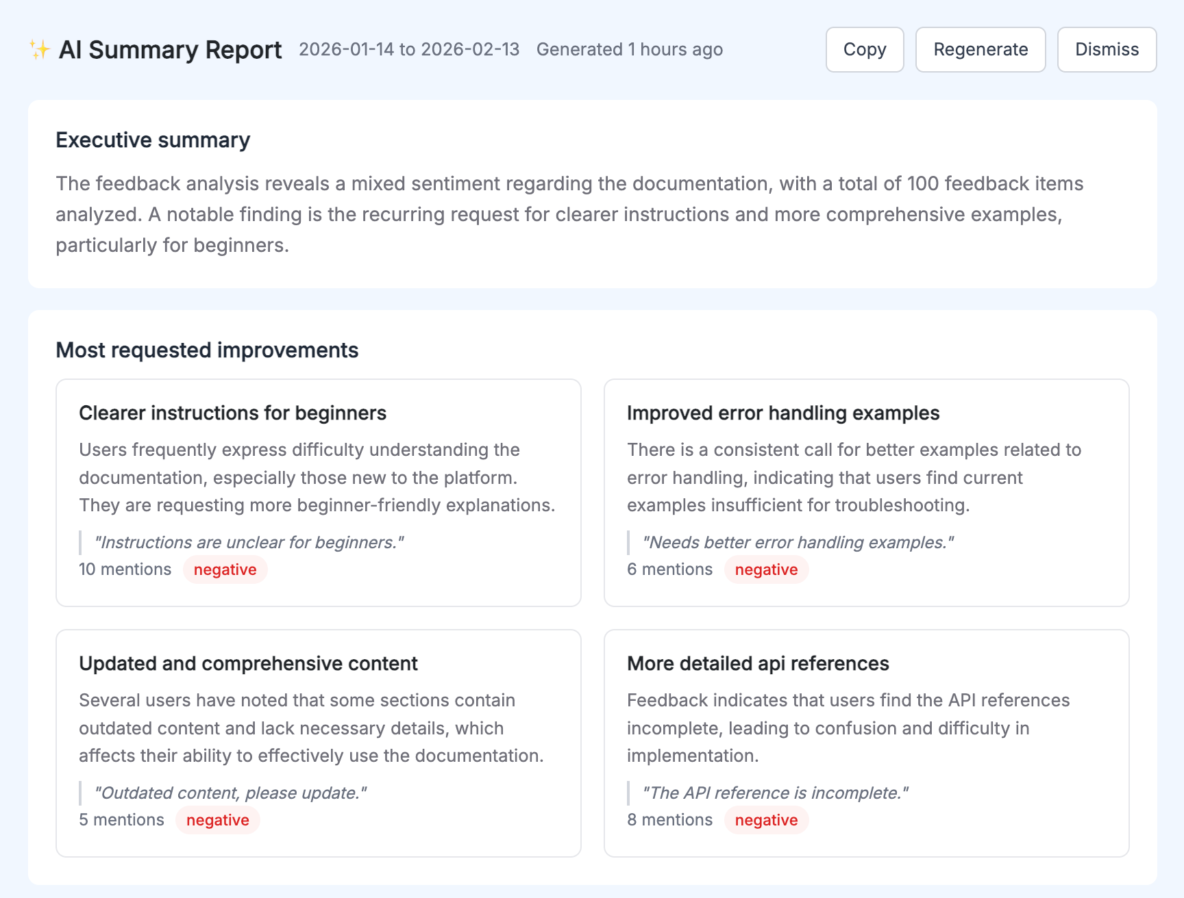
AI Reports process your full feedback dataset and surface what manual review misses:
- The top 3 to 5 recurring themes across all your feedback, with mention counts and representative quotes
- Sentiment classification for each feedback item
- An executive summary covering the state of your docs overall
- Actionable recommendations for specific pages and topics
The practical difference: instead of spending three hours reading comments and building a spreadsheet, you get a structured analysis in seconds. The themes are already identified and ranked. The quotes that best represent each theme are already pulled out. The priority order is already determined by mention frequency.
More importantly, AI analysis catches patterns that humans miss when reading comments linearly. When you read 200 comments one at a time, you build a mental model that's biased toward the comments you read most recently. Algorithmic analysis weighs all comments equally.
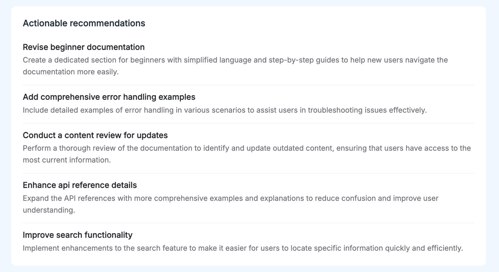
The recommendations aren't generic. They're based on what your specific users said about your specific pages. "Add a code example showing token refresh flow to the Authentication page" is something a team can act on today. "Improve clarity" is not.
Turning feedback data into a documentation improvement cycle
Data without action is just reporting. The goal is to close the loop: measure, fix, measure again.
Prioritize by feedback volume and sentiment
Not all documentation problems are equally urgent. A quick triage framework:
Fix immediately: Pages where negative feedback is above 40% and feedback volume is high. These pages are actively failing a significant portion of your users.
Fix this sprint: Pages where negative feedback is between 20 to 40% with consistent thematic complaints. You know what's wrong, you just need to schedule the work.
Watch and monitor: Pages where negative feedback is below 20% but trending upward. They're not critical yet, but something changed.
Keep doing what you're doing: Pages with stable, high positive feedback. Understand what makes them work and apply those patterns elsewhere.
Make documentation changes traceable
Before you update a page, record the current feedback metrics: rating ratio, volume, top comment themes. After the update, note the date.
Two weeks later, check whether the metrics moved. This gives you a measurable answer to "did this update help?" and builds institutional knowledge about which types of changes have the most impact.
For a deeper look at how to structure this process from the beginning, The complete guide to collecting and analyzing documentation feedback covers the full workflow from collection through analysis.
Treat documentation quality as an ongoing process, not a one-time audit
The teams that consistently ship good documentation don't do periodic "documentation sprints" where they fix everything and then ignore it for six months. They maintain a continuous feedback loop:
- New pages launch with the widget already installed
- Feedback data is reviewed weekly, not monthly
- Updates are tracked and their impact is measured
- Recurring themes from AI reports feed directly into the documentation backlog
This is the difference between documentation that degrades slowly over time and documentation that improves. Without measurement, you're guessing. With measurement, you're learning.
The metrics to start with today
If you're not measuring documentation quality at all right now, start with two numbers:
Negative feedback ratio by page. Sort your pages by thumbs down percentage. The top 10 on that list are where you should spend your next documentation sprint.
Feedback volume per page. Overlay this with your traffic data. Pages where volume is high but the rating ratio is poor are affecting the most users.
Everything else, sentiment trends, AI analysis, time-to-resolution tracking, builds on having these two baselines in place. You can't measure improvement if you don't know where you started.
For the full picture on which metrics matter across different types of feedback programs, Top 5 feedback metrics you should track and why covers the broader landscape beyond documentation-specific signals.
The most accurate measure of documentation quality is whether your users can do what they came to do. Feedback data is the closest proxy you have. Start collecting it, and you'll have more clarity about what to fix in a month than most teams get from a year of analytics.
PushFeedback adds a feedback widget to your documentation pages that captures ratings, comments, and screenshots. The analytics dashboard tracks page-level metrics and sentiment trends, and AI Reports surface recurring themes automatically. You can get started in minutes with any major documentation platform.